Wednesday, July 2, 2014

Removeable Reference Lines

Directions:

  • Connect to Sample-Superstore-English (Extract) from your saved data sources, all licenses of Tableau Desktop 8.2 come with this sample data
  • Create a Parameter to give the users control over reference lines
    • Data type should be string
    • Use list for values
    • The values should be "Show" and "Hide"

  • Create the following calculated field to drive the parameter selection: 
 
  •  To build the view:
    • Discrete Year to columns
    • Discrete Quarter to columns
    • Sum(Sales) to rows
    • "Average Sales" calculation to detail
      • Make sure to right click and edit the Average Sales calculation and change it to compute using "Pane Across" instead of table across. 
    • Right click on the Sales Axis and add a reference line.
    • Set the value to "Average Sales"
    • Set Label to value


End Result:


Tuesday, July 1, 2014

Dynamic Formatting

Directions:

  • Connect to Sample-Superstore-English (Extract) from your saved data sources, all licenses of Tableau Desktop 8.2 come with this sample data.
  • Create a Parameter to drive measure selection:
  • Data type should be string
  • Use list for values
  • The values should relate to Profit Ratio (sum(Profit)/sum(Sales)), SUM(Sales), SUM(Profit), and AVG([Shipping Cost])

  •  Create a calculated field that is only the "Dynamic Format" Parameter
  • Create four worksheets, all with category on columns and one of the 4 measures on rows
  • Format each work sheet with the appropriate number format
  • Place "Dynamic Format" calculated field on the filters shelf
    • From General select Custom Value List
    • Enter the text that references the measure on the worksheet
    • Repeat this step for all four worksheets

  • Create a new blank dashboard
  • Place a vertical layout container in the dashboard
  • Bring all four worksheets into the layout container and remove all worksheet titles
  • Show Parameter Control 
  • You can now select between measures and have the default number formats of each measure display on label as you select between worksheets.


How to add a Bar Chart to the Tooltip


How to show multiple marks in a worksheet

Directions:

  • Connect to Sample-Superstore-English (Extract) from your saved data sources, all licenses of Tableau Desktop 8.2 come with this sample data.
  • Create the following 3 calculated fields:


  • Right click on Spacer and set the default number format to minimum
    • Default Properties > Aggregation> Minimum
Building the view
  • Start building the view by bringing out the following:


  • Right click on SUM(Sales) and run the "Difference" Quick Table calculation
    • Quick Table Calculation>Difference
  •  Show Data in Default Position


Adjusting the marks
  • Set the marks cards as following:


Formatting
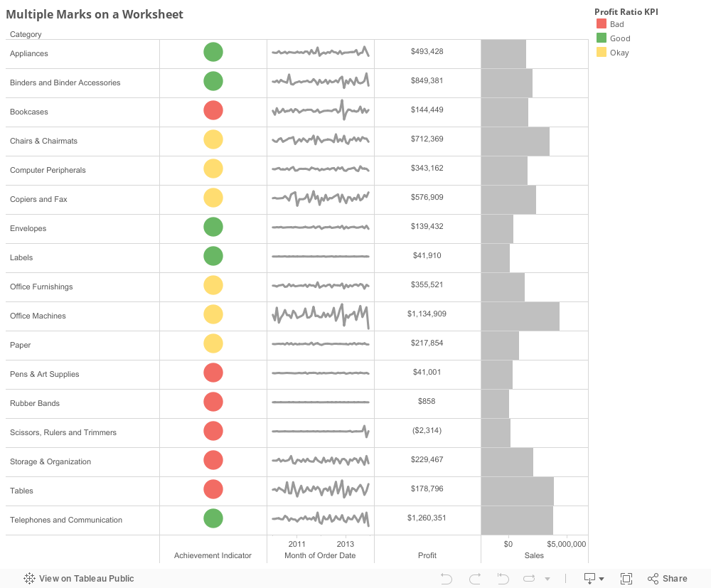
  • Change the color of the Profit Ratio KPI Legend to Red, Yellow, Green

  • Adjust the cell size by using shortcut Ctrl+Shift+B or by using the format drop down menu.
  • Right click on the SUM(Sales) Difference Axis and uncheck "Show header"
  • Rick click on the SUM(Sales) Axis under the Gantt Bar and add a reference line with the following settings:

  • Set the Gantt Bar color to 0% transparency
  • Right click in the view and set the grid lines to and zero lines to "None"

  • Finish up by changing the axis on the bottom of the stoplight to say "Achievement Indicator" instead of Spacer and set tick marks to none. 
  • Change the name of the profit column to "Profit" instead of "Spacer" and remove tick marks.

The Purpose
The reason that this trick is particularly useful in Tableau is that it unlocks far more potential for dynamic sizing than a dashboard. You don't have to worry about worksheets moving around in a dashboard when you automatically adjust this view. This view also allows you to select one row, or category in this instance and have it highlight across the category name, stoplight, sparkline, profit text, and sales bar.

Thanks for reading and happy analyzing!

Josh


Tags: Tableau tips and tricks, viz, visuals, analysis, business, hacks, tutorial, help, software, BI, business intelligence